

A lot has changed since Teamtailor was founded in Stockholm in 2013.
What started as a small Swedish startup has grown into a global recruitment technology company, helping organizations around the world find and hire the people who move them forward.
Along the way, our product has evolved, our team has grown, and our ambitions have become bigger. But while Teamtailor kept moving forward, our visual identity hadn’t quite kept pace. We felt it was time to change that, not because we wanted to become something different, but because we wanted to better express who we’ve become, what we believe in, and where we’re heading.
Starting with what matters
Before thinking about colors, typography, or logos, we went back to something much more fundamental: why we exist.
At Teamtailor, we’ve always believed in the importance of people. Behind every successful company, every ambitious idea, and every meaningful achievement, there are people making things happen. And sometimes, the right person can make all the difference.
“The right hire can change everything”
It’s a simple belief, but one that carries a lot of meaning for us. Because hiring isn’t just about filling positions. It’s about bringing people together, creating opportunities, and building teams capable of achieving things that wouldn’t be possible otherwise.
That belief became an important foundation for our new visual identity.
The power of working together
When we started exploring how to express this visually, we kept coming back to the idea of teamwork.
Great teams aren’t defined by one individual. They’re shaped by the different people, personalities, perspectives, and abilities that come together to create something greater. We wanted our identity to reflect that same principle, and nowhere is that thinking more evident than in our new wordmark.
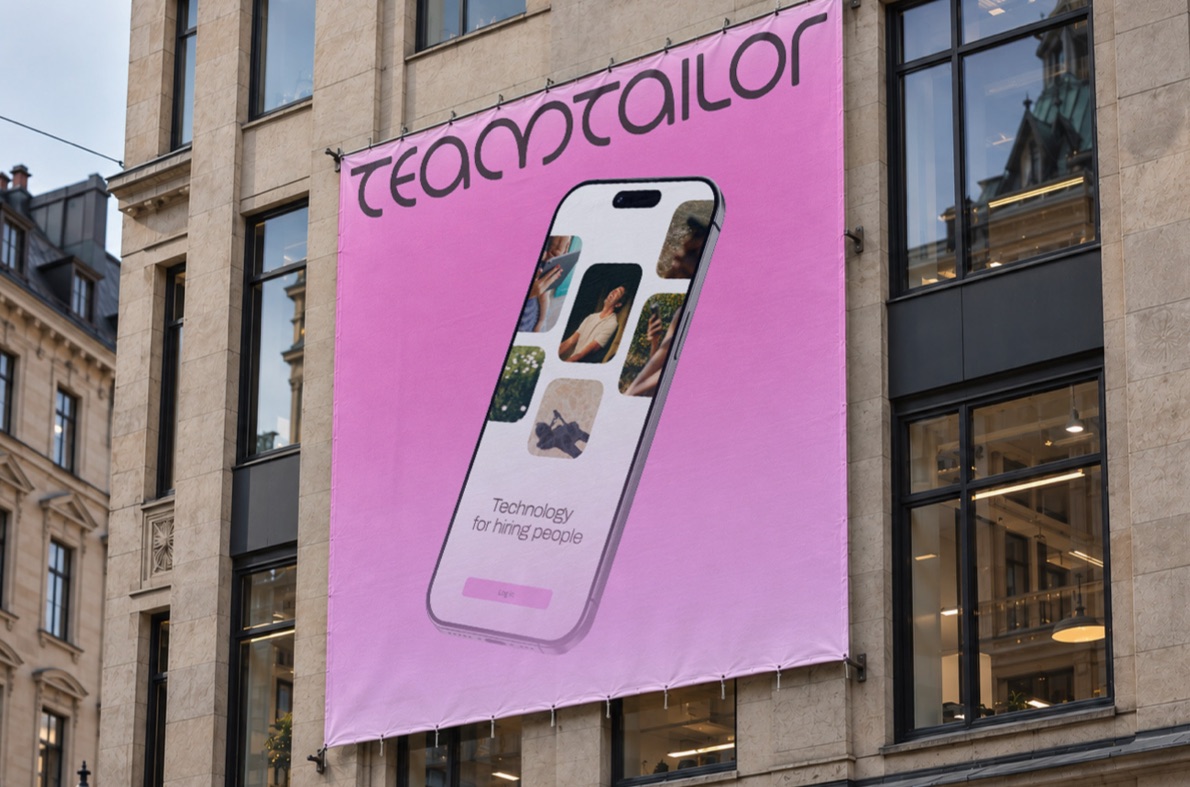
Rather than designing a logo around one distinctive character or symbol, we approached the letters as a collective. Each has its own role, but none is more important than the others.
“No single letter defines the wordmark, just as no single individual defines a great team.”
It’s a small detail with a bigger meaning, and one that helped guide the design throughout the process.
An identity built to work together
The same thinking extends beyond the wordmark.
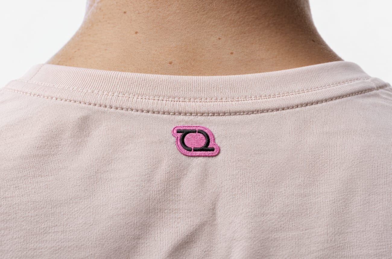
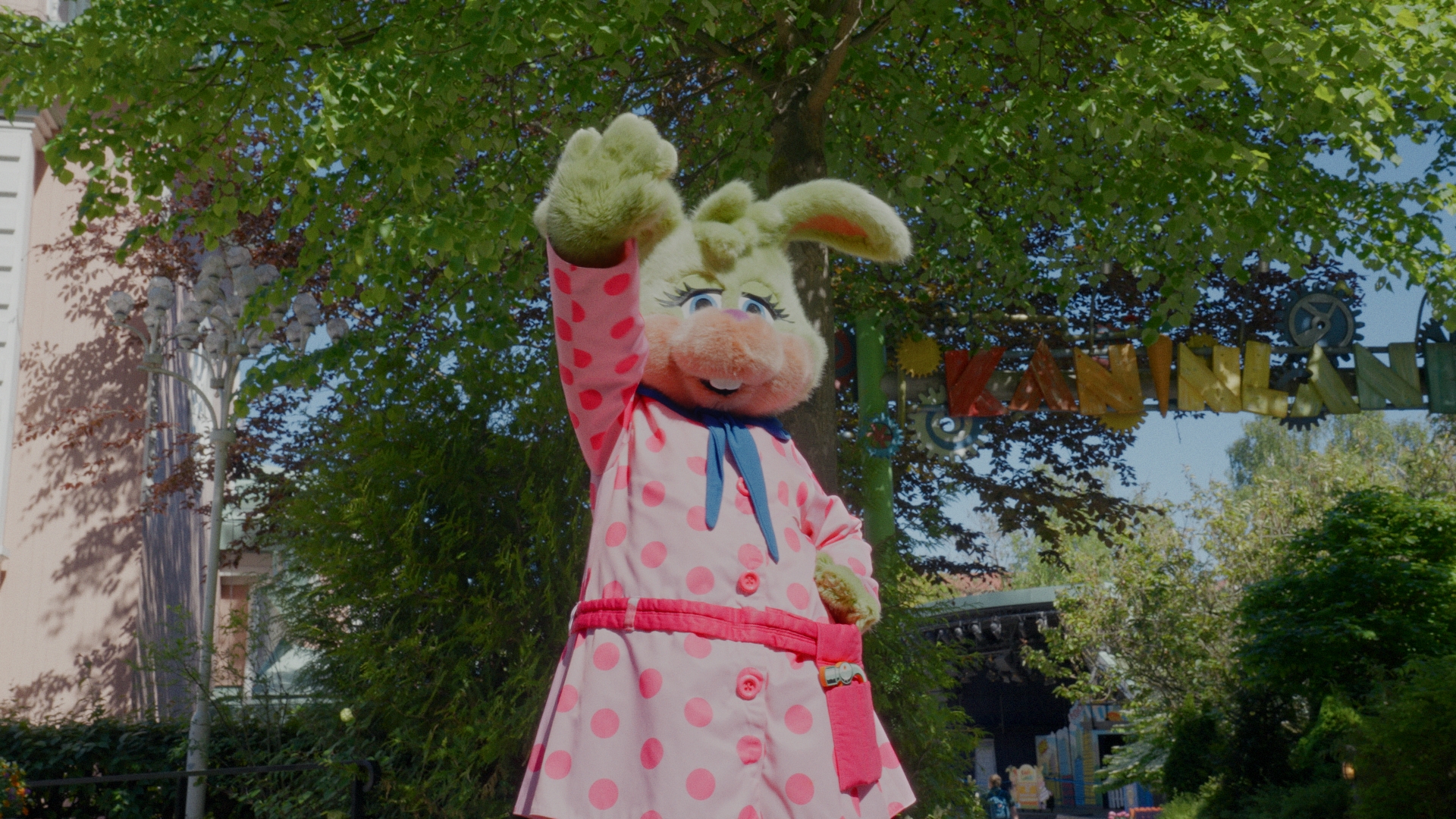
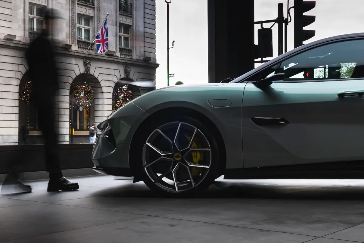
Our new visual identity brings together typography, color, imagery, and graphic elements to create a more distinctive and cohesive expression of Teamtailor. Every element has a purpose, but the real strength comes from how they work together.
We wanted to create something that feels confident without being distant, expressive without being complicated, and recognizable without losing the warmth and personality that have always been part of Teamtailor.
An identity that feels just as natural in our product as it does in a campaign, on a billboard, or in a conversation with our customers. Something that can grow with us, rather than hold us back.
“For hiring people.”
At the center of it all is a simple idea: For hiring people.
It’s who we build our technology for. The recruiters, hiring managers, and teams who understand just how much the right person can mean to an organization.
But it’s also a reflection of what we believe in. That technology should support people, not overshadow them. That great hiring is fundamentally human. And that bringing the right people together can make extraordinary things possible.
Our new identity gives us a way to express those beliefs with greater clarity, confidence, and character.
A new chapter
A visual identity is never the whole story of a brand. It’s how that story becomes visible.
And while we’re proud to introduce this new chapter, we know that Teamtailor will continue to evolve, just like the people and organizations we work with every day.
The way we look may have changed, but what we believe in hasn’t.
The right hire can change everything.